


The colour is the light. |
| With Guy GONZALEZ, colourist, painter and decorator, we will consider in this chapter the colour used in decoration purpose and to its interpretation by men and women. |
The visual feelings of colours are different
from one person to an other, giving a subjective judgment. The psychology
of colours is therefore important. Nevertheless, we can find some universal rules. |
| For the painter (subtractive synthesis), there are three fundamental colours, also called primary colours : Blue, red and yellow. In a more precise way, Cyan - Magenta - Yelow. |  |
|||
 |
For photography and screens (additive synthesis), primary colours are red, green and blue. | |||
Mixing of 2 primary
colours gives a secondary colour. Mixing of a primary with a secondary colour gives a tertiary colour. |
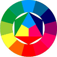 |
White and black are not really
considered as colours, white being the reflection of all the colours and
black being the absorption of all the colours. Grey is by the way a neutral colour. |
||
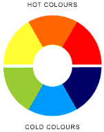
| Depending on your room exposure to the sunlight, choose hot or cold tones according to your sensations, and create a personal atmosphere. | ||||
| (The same room painted with hot tones gives the feeling of a 3°C higher temperature compared with the case of a room painted with cold tones). | ||||
 |
 |
 |
||
Hot colours
: yellow, orange, red, and derivatives. Yellow colours are vibrant. Red including a dominance in orange generate conviviality and a reassuring atmosthere. Red and its derivatives are stimulating. Cold colours : Green colours give a feeling of quietness. The blue colour range gives the feeling of coolness. Violet and Mauve give a sensation of relaxation. White represents brightness but also uniformity. Grey walls give seriousness (or sadness) to the room. |
||||
Warning, this interpretation
changes depending on the considered civilisation culture. |
||||
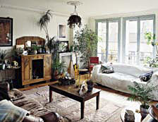 |
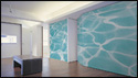
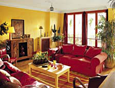
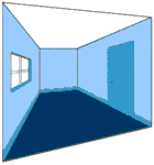
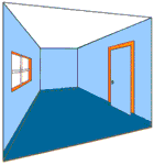
This living room painted in white is of a wide
brightness, but is deficient in temper compared with the right-hand picture.
In yellow and orange, this room seems more vibrant but looses its brightness. A tip for white : Always choose a white colour with an imperceptible quantity of ultramarine blue. It will become blazing, volumes and shadows (cornices, columns, etc...) will be nicer (Chevreul theory). |
 |
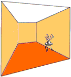
Colours and volumes.It is possible to correct the volume of a room or to modify its size by using only colours. |
||||
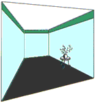
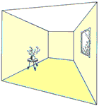
| Raise a ceiling : - Paint the walls with a dark colour, the ceiling with a bright colour and put the lighting at the ceiling. - Or choose a decoration using vertical shapes on the walls. |
 |
 |
||
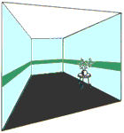
| Lower a ceiling : - Using a fall out or a frieze. - Using a frieze or a cyma in the middle of the walls. |
 |
 |
||
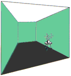
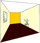
Widen a corridor : - Paint the back wall with an intense or dark colour, the side walls and the ceiling with bright colour. |
 |
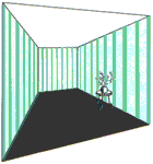
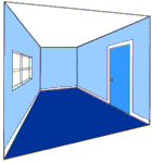
Enlarge a room : - Choose a bright colour. Use similar tones for the walls, the ceiling and the floor (self-coloured or camaieu). |
 |
|
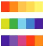
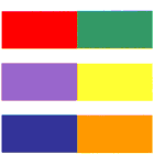
Associated colours.Isolated or associated colours generate different feelings.It is recommended to associate 3 colours maximum inside a room. |
||
| Self-coloured : This is the same tint using tones from the dark to the bright. |
 |
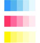 |
| Camaieu : This is the range of tints in the region of a chosen colour on the chromatic circle. |
 |
 |
| Complementary colours : These are opposite tints on the chromatic circle. |
 |
 |
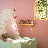 |
For association of colours, it
is recommended to use different tints (e.g. : pale pink + intense yellow).
It is also important to associate colours according to the room dimensions,
for example : pale pink as the leading colour for the walls, and intense
yellow as accessory colour for the windows, door frames, ... On the present picture, we can see that the cradle is of a complementary colour as the one of the walls. |
|
![]()
| Top of page |